Mycelium Redesign
Evaluated the Mycelium Crypto Wallet app based on Nielsen Norman group's usability heuristics. Followed with a heuristic redesign, while preserving the original branding.
Roles:
• Heuristic Evaluator
• Heuristic Redesign
(Collaboration with Sebastian Davidson)
Timeframe:
2 weeks
Tools:
• Figma
About Mycelium and the Evaluated Task Flow
Mycelium is a bitcoin wallet app. It allows you to store your Bitcoins, Ethereum or other ERC-20 Tokens on the Ethereum Network. Mycelium also allows you to send and receive these cryptocurrencies to other wallets.
It’s available on many different platforms, however, for our evaluation we chose to focus on the iOS version of the app.
Another thing to note is that Mycelium is a noncustodial wallet, meaning you have sole control of your private keys, making it much more secure.
It’s also a reproduceable wallet meaning if you lose your phone or delete the app, you’ll always have access to the coins as long as you have the master key which is a unique string of 12 words.
We chose to focus on the process of making a new wallet, generating a master seed (also known as a seed phrase) and backing up the master key.
Constraints
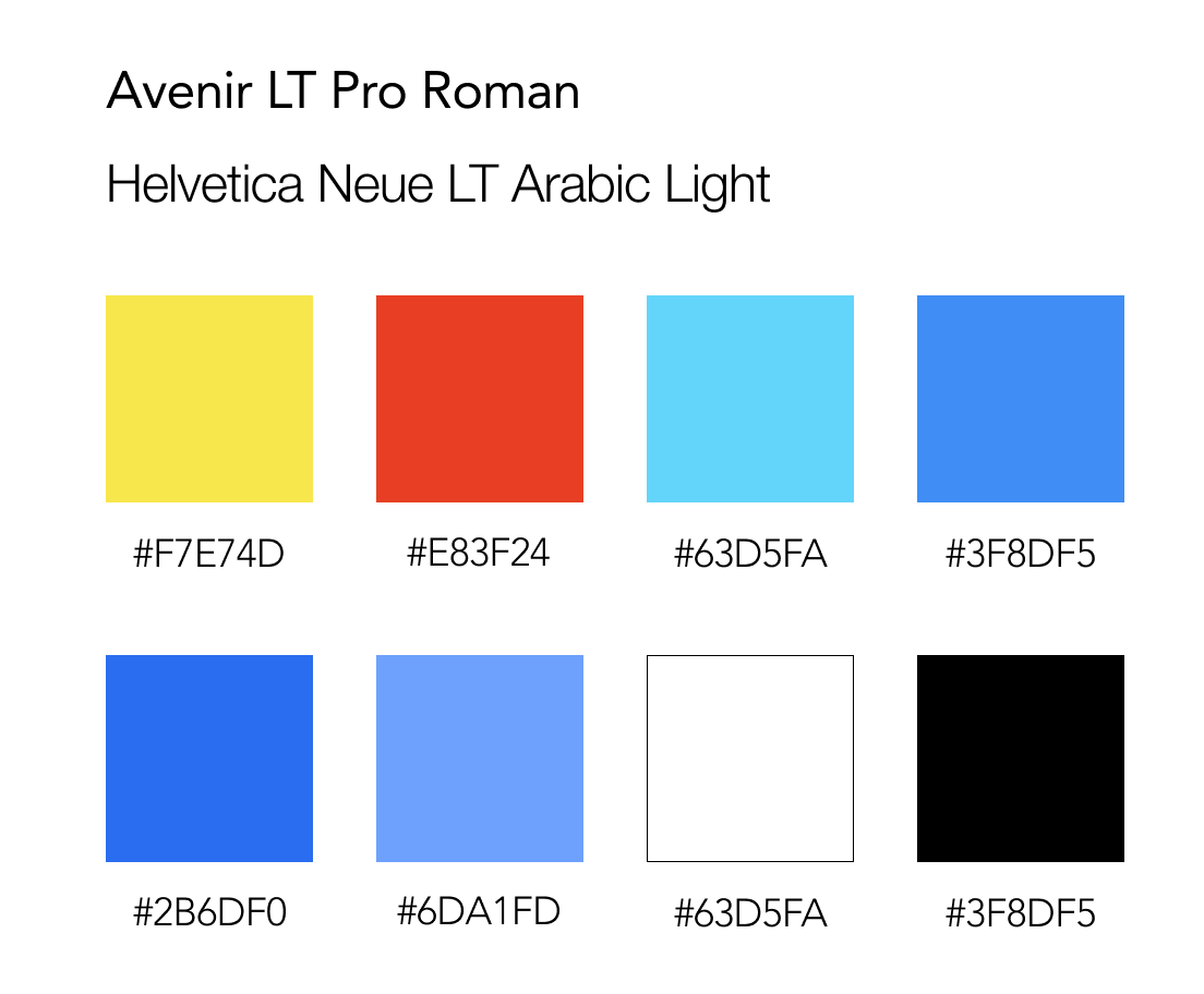
For this project a set constraint was that we must keep the original branding, so as to focus more on the usability itself.
The logo uses the font Avenir LT Pro Roman (familiar enough to this website), while the text throughout the app is the font Helvetica Neue LT Arabic Light.
You'll find the logo colours on the top row of the image on the left, and below it are the background, button, and text colours.
Evaluation Scale
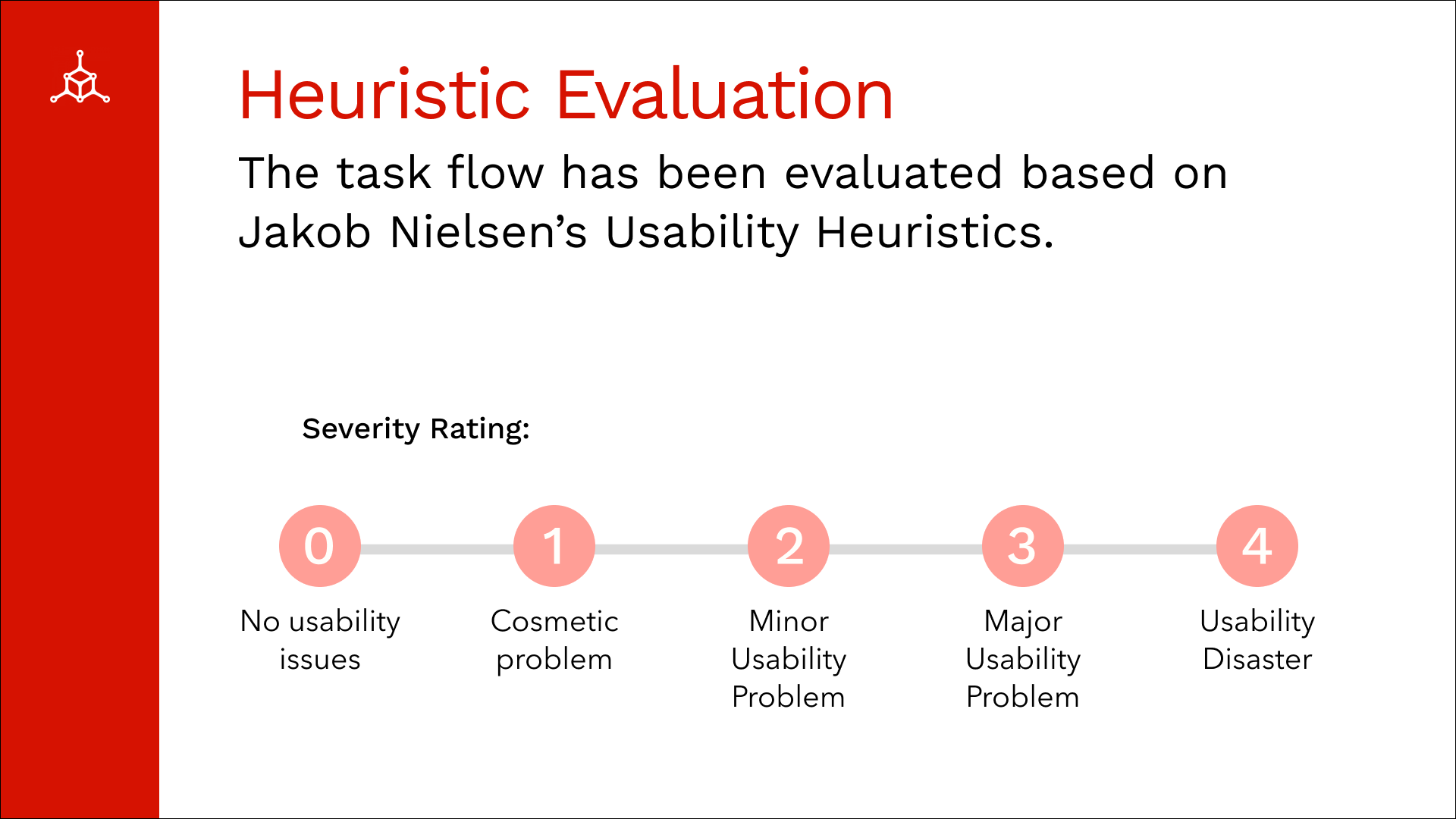
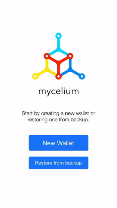
Violation of Heuristic #8: Aesthetic
Severity: 1/4
Issues:
• Design is outdated and basic
• Text does not compliment the logo font
• Buttons are different sizes
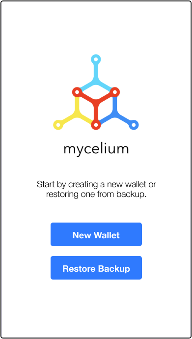
Design Improvements:
• Made button sizes consistent
• Changed button text to be the same size and bolded it for better text hierarchy
Before
After
Violation of Heuristic #4: Consistency and Standards
Severity: 1/4
Issues:
• Button styles are inconsistent
• Margins differ throughout task flow
Design Improvements:
• Changed all buttons throughout task flow
• Made margins consistent
Before
After
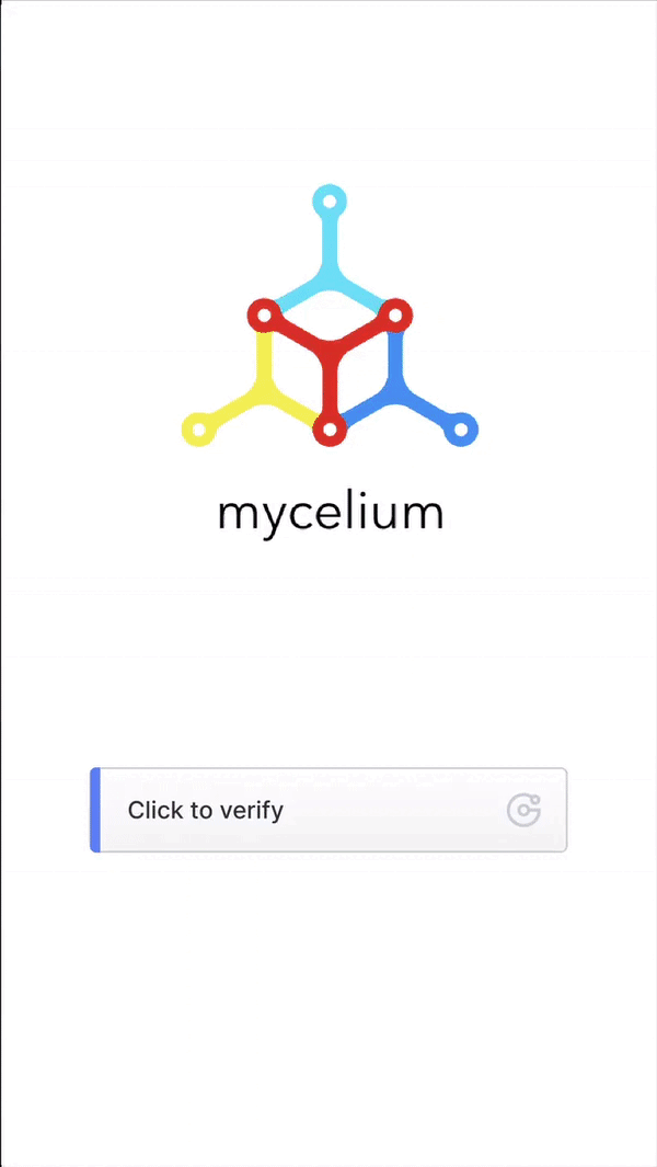
Violation of Heuristic #7: Flexibility and Efficiency of Use
Severity: 3/4
Issues:
• Inaccessible for users with physical disabilities that cannot shake phone
• Impossible if the gyroscope or acceleromoter in phone is broken
Design Improvements:
• Got rid of the Shake Function
• Replaced with a Jigsaw Slide to increase accessibility, as most mobile users are able to swipe the screen
Before
After
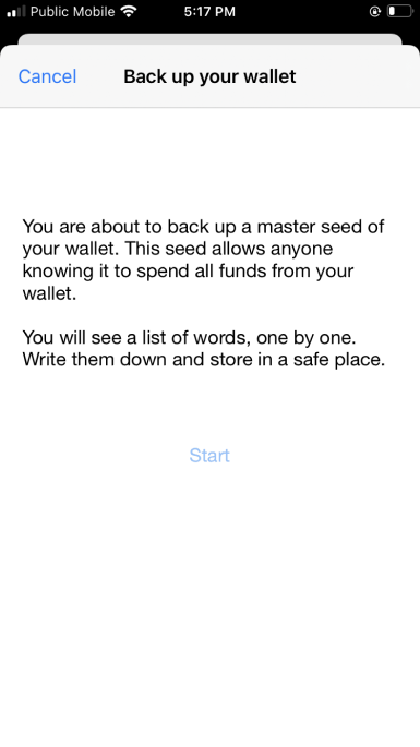
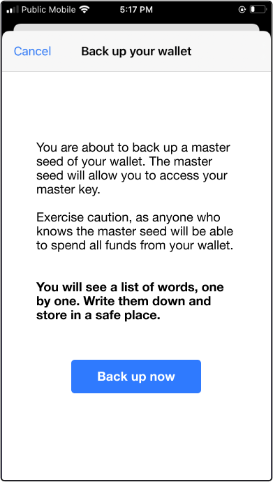
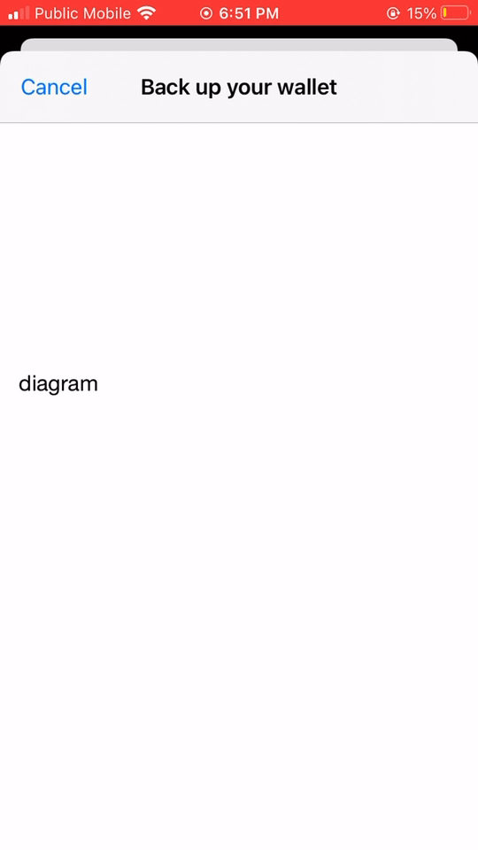
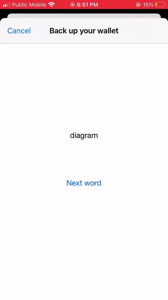
Violation of Heuristic #10: Help and Documentation
Severity: 1/4
Issues:
• Two different yet related phrases (“Master Key” and “Master Seed”) are used seemingly interchangeably
• This could cause new users to be confused about the process
Design Improvements:
• Rephrased screen
• Explained the relationship between the term Master Seed and Master Key
Before

After

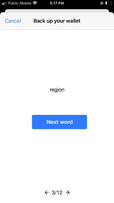
Violation of Heuristic #3: User Control and Freedom
Severity: 2/4
Issues:
• There is no back button
• User can swipe forward or backwards, but no indication is present
• Not very intuitive for most users
Design Improvements:
• Added page numbers
• Indicated the ability to swipe / added forward & backward buttons
Before
After
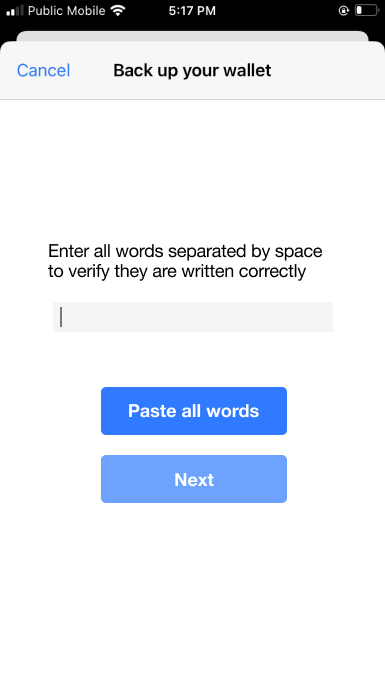
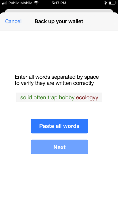
Violation of Heuristic #7: Flexibility and Efficiency of Use
Severity: 2/4
Issues:
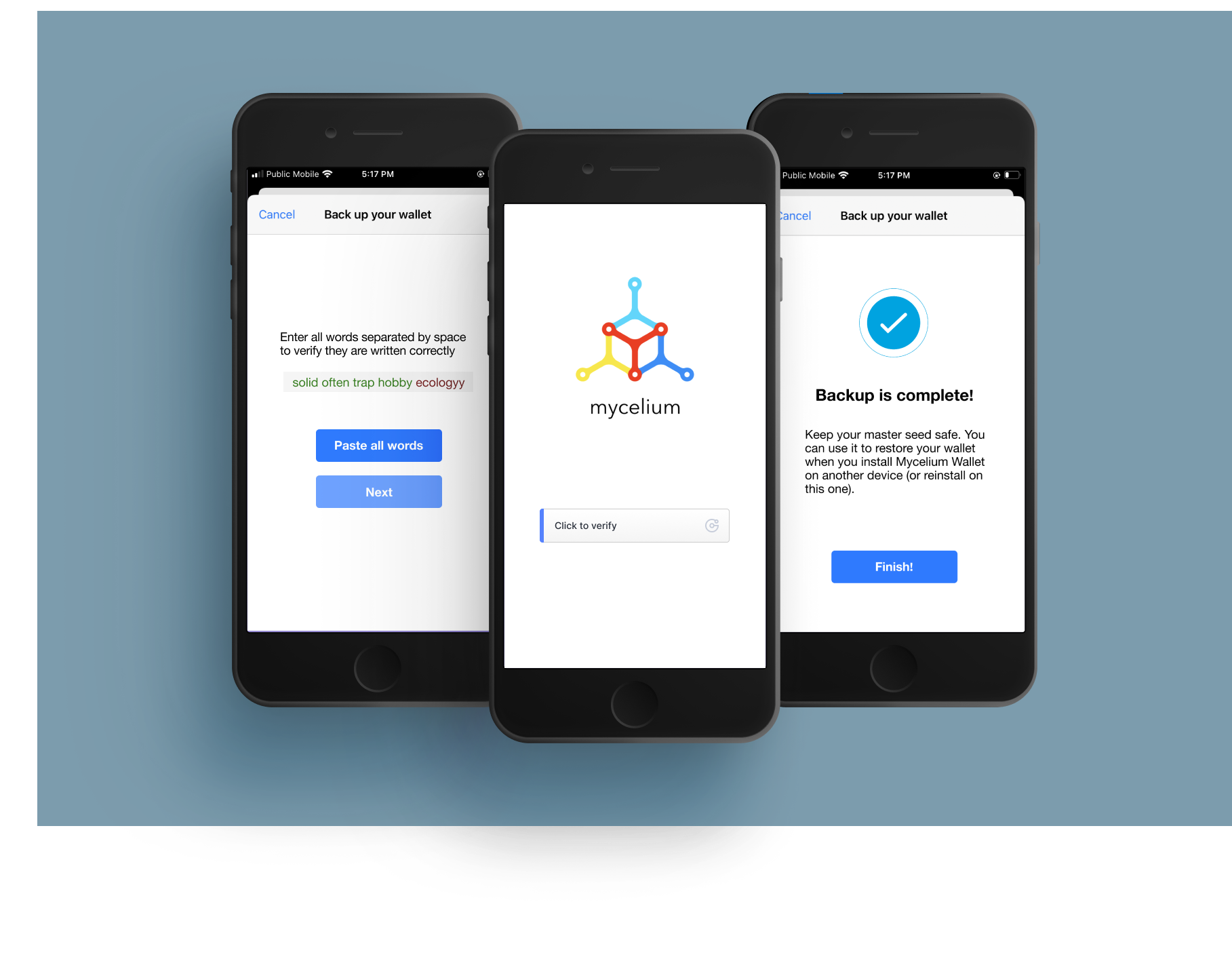
• Forces users to retype the 12 words they just finished writing down
• Redundancy in task
• Slows down the process
Design Improvements:
• New button allows user to paste all words seen on previous screens
Before
After
Violation of Heuristic #5: Error Prevention
Severity: 1/4
Issues:
• Not very obvious that the user has made a mistake
• If entered with an incorrect word, the user will have to start all over again
Design Improvements:
• Incorrect words are shown in red to indicate a user error
Before
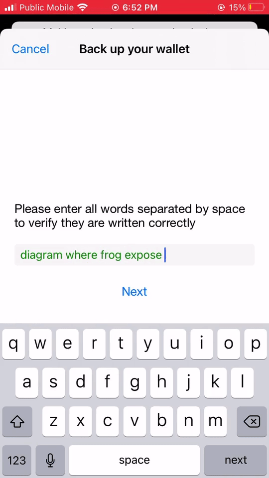
After
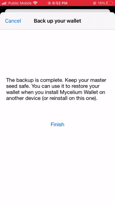
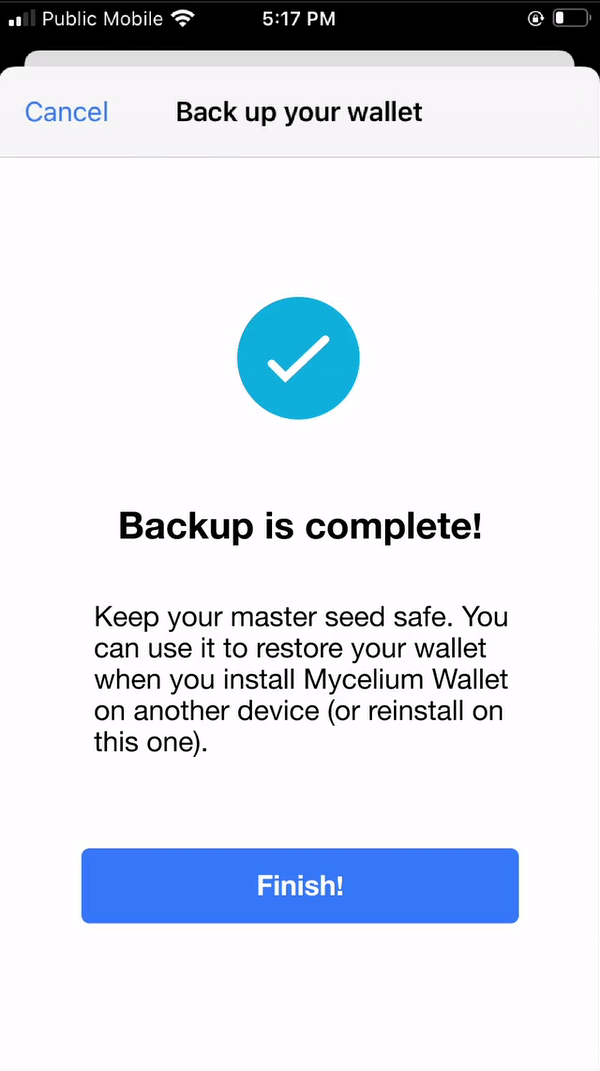
Violation of Heuristic #8: Aesthetic
Severity: 1/4
Issues:
• The visuals don’t make the user feel like they’ve completed anything
• Lacking excitement
Design Improvements:
• Added animation to indicate completion
• Changed font weights for improved visual hierarchy
• Clearer “Finish” button
Before
After
Next Steps
As for the next steps we would like to redesign the aesthetic of the app. We think there’s lots of potential for a visual revamp and to update aspects of the branding.
Potential Design Improvements:
• Repick colours featured in app
• Choose body text to better pair with the logo font
• Update visual aspects to modernize the look of the app
• Redesign home page
Selected Works

ChatFusionProject type

Webhook Reference Page RedesignProject type

BreakTimeHackathon Industry Project

Safe&SoundCapstone Project
Mycelium App RedesignHeuristic Redesign