Safe&Sound
A mobile app designed to connect music festival attendees to a variety of resources and amenities, in order to prevent the common health and safety issues found in this setting.
Created as a Capstone Project while taking the BrainStation UX Design program.
Roles:
• UX/UI Designer
• Researcher
Timeframe:
9 weeks
Tools:
• Figma
• InVision
Problem Space
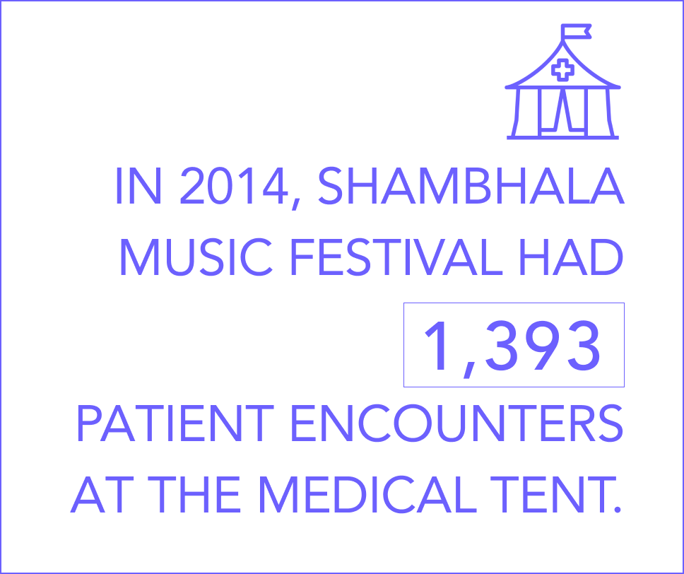
Ever since live music shows have existed, so have the medical emergencies, predators and questionable substance distribution that infiltrate them.
After the recent tragedy of the Astroworld Festival incident, the topic of music festival safety has been illuminated to the general public’s eye. What are the potential dangers involved in music festivals and shows? How are they currently being addressed and what can we do to mitigate these issues in novel ways?
Secondary Research Key Takeaways
My first step towards a deeper understanding of this problem space was to conduct research via academic research, articles, and statistics.
The most common medical encounters at music festivals include:
• Issues resulting from recreational substance intake and misrepresentation
• Dehydration and heat stroke
• Head and foot injuries
Other common safety-related issues include:
• Sexual assault
• Attendees losing track of the location of their tent and/or friends
• Recently, COVID-19 contagion
Primary Research
Next, I wrote relevant, open-ended interview questions based on my primary research findings, and scouted people who fit the interview participant criteria.
Interview Key Takeaways:
• Currently, attempting to find someone with a walkie-talkie is the most utilised strategy when seeking out help, and it’s not always a streamlined process
• Important bulletins and announcements are not as accessible as they would be ideally
• Many people have a hard time finding their tent at night
• Dealing with predators is a prevalent and complex issue at festivals
After analyzing the research to discover focal pain points and the current safety systems in place, I formulated a design question to ideate on:
How might we better connect festival attendees with safety-related information and emergency resources to make festival and concert spaces a safer place for everyone?
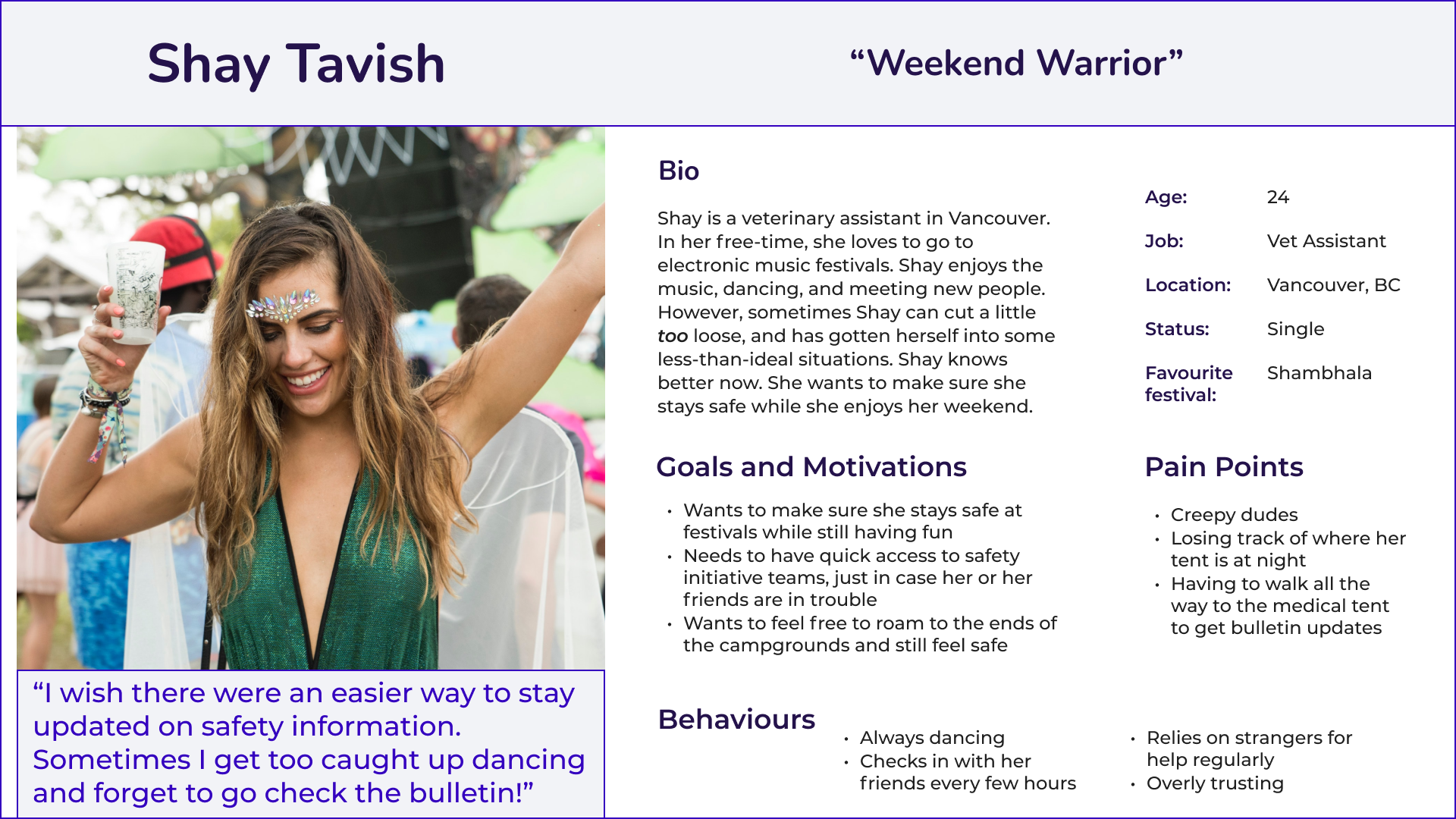
User Persona
Using insights identified in the research phase, I created a user persona that reflected the target user base to help guide design decisions.
User Stories and Epics
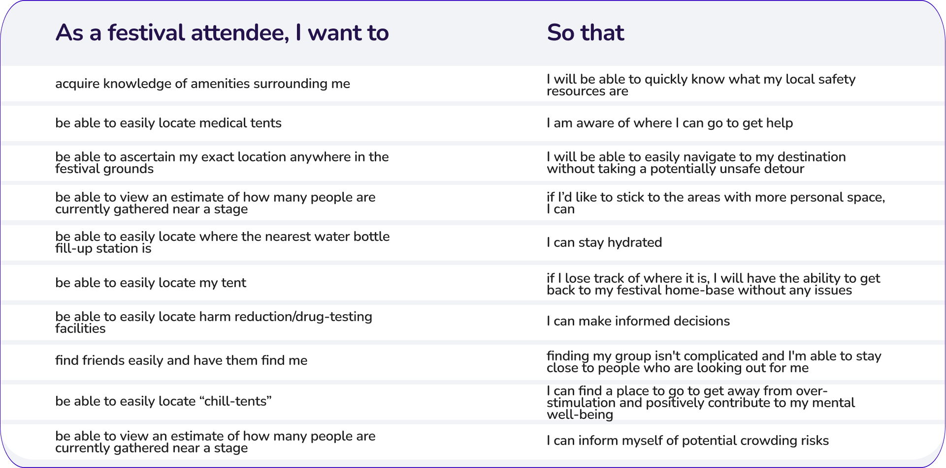
After the target user was identified, I began to author user stories that would help me identify what the user would want to accomplish by using the design solution, to help keep features focused on the user's needs and desires.
I authored 30 user stories and separated them into 3 main epics:
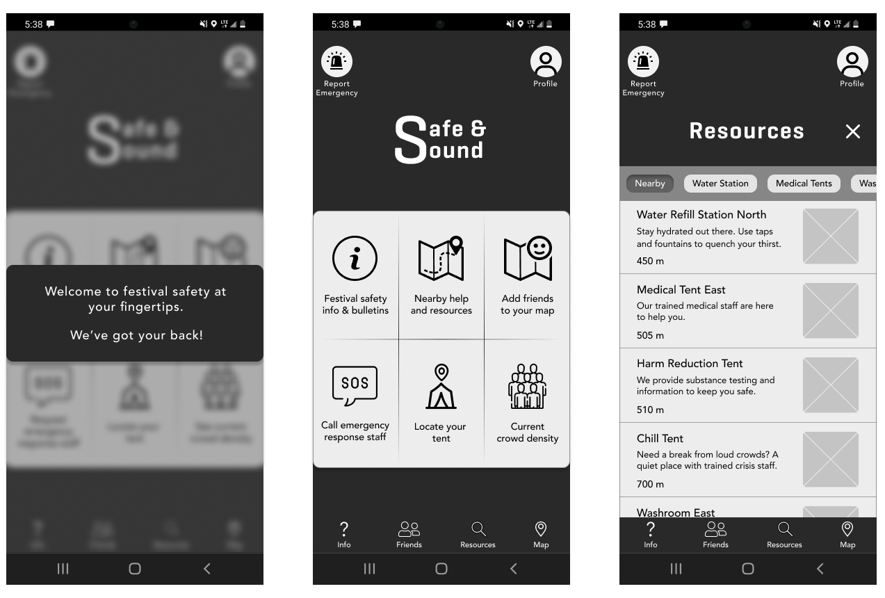
• Access to festival safety information
• Access to medical assistance
• Easier location of important locations / people (shown in left image)
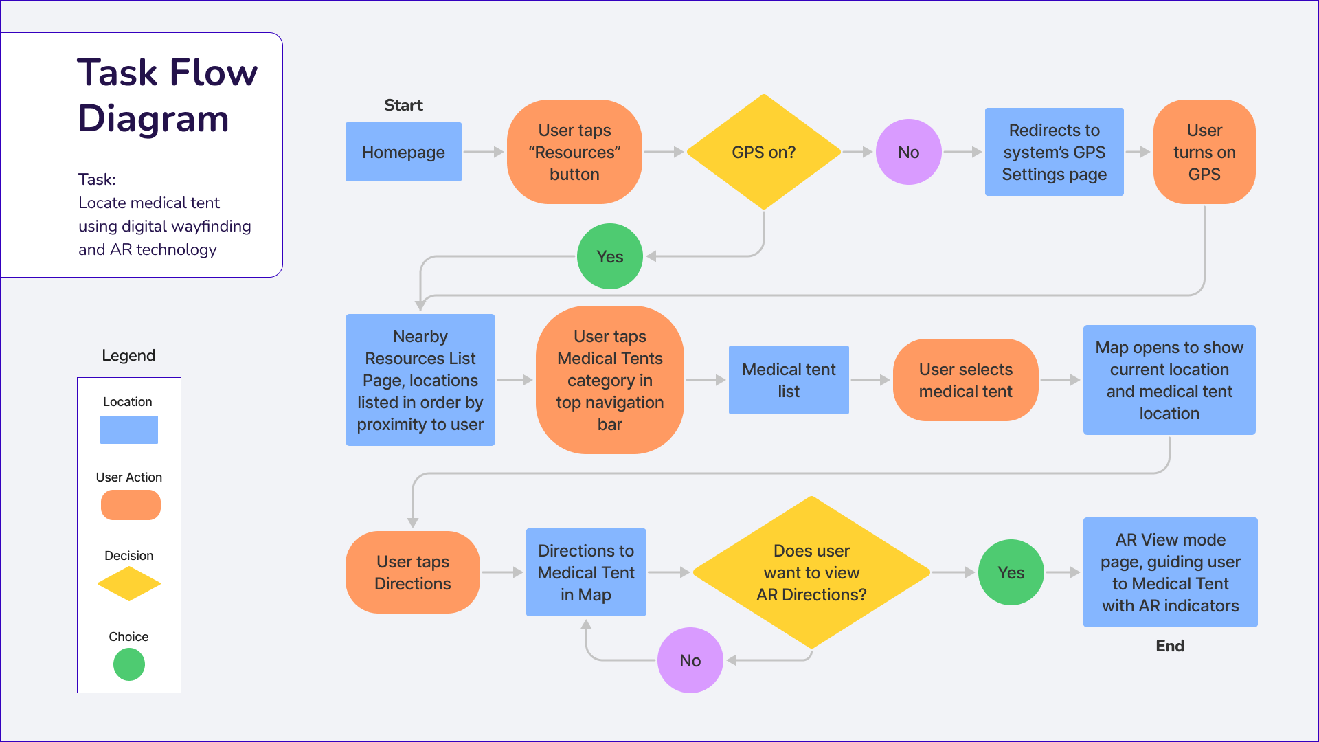
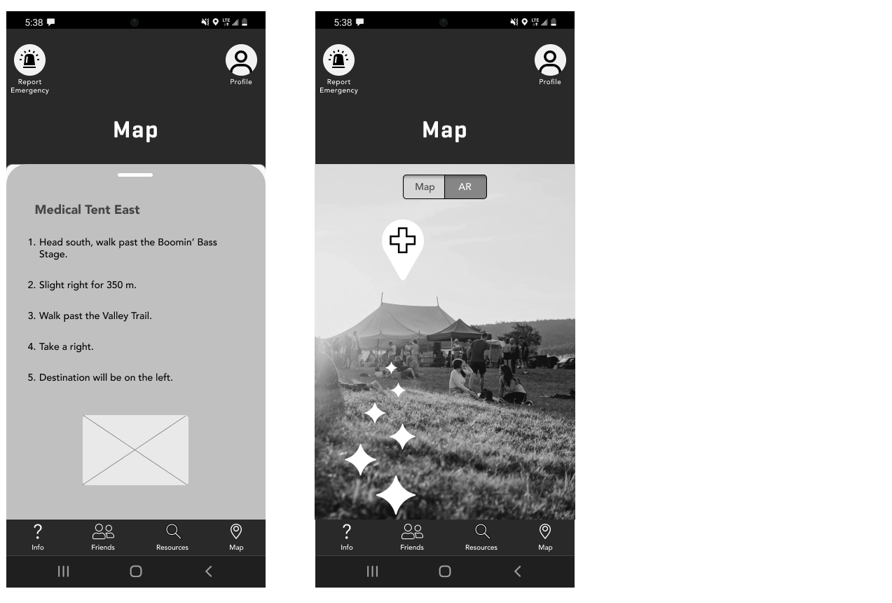
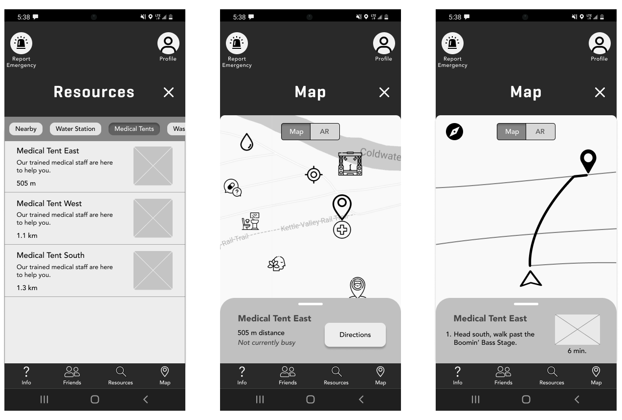
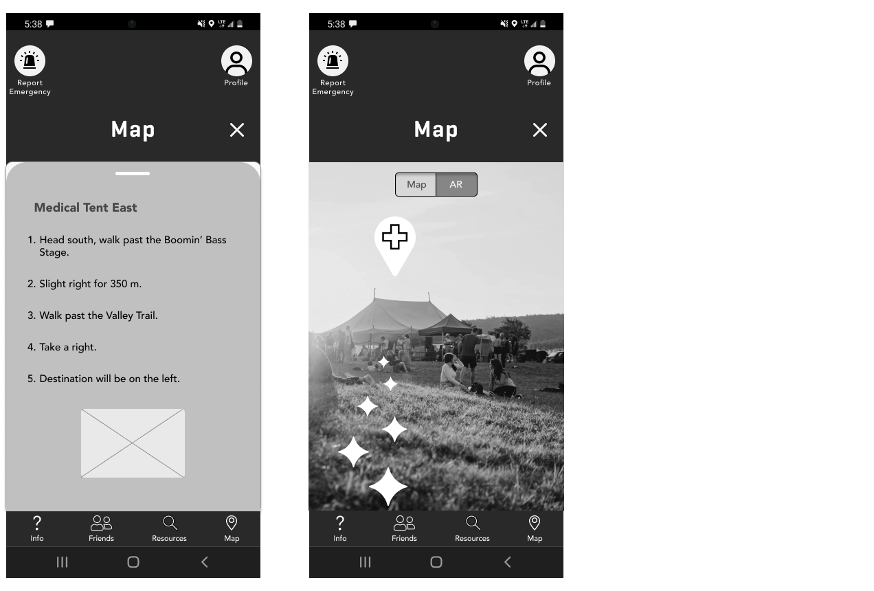
From there, I used the "Easier location of important locations / people" to create the task flow.
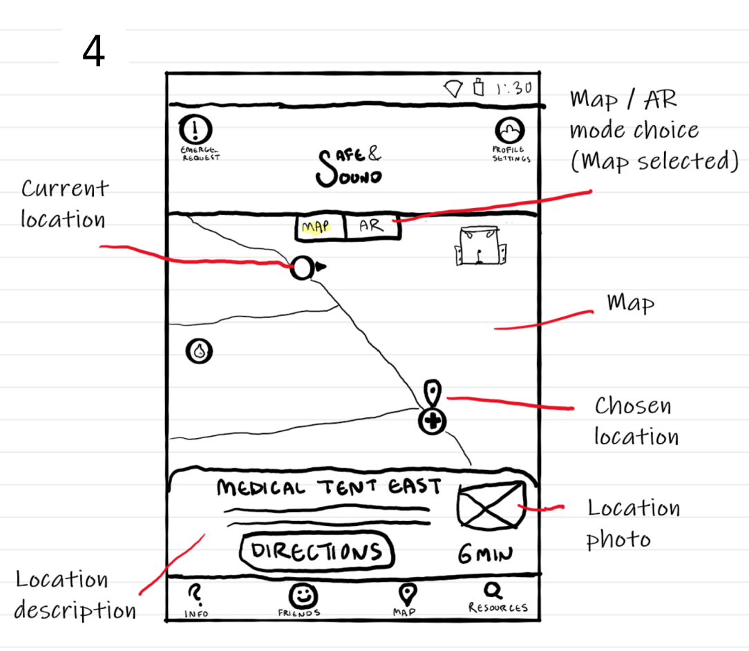
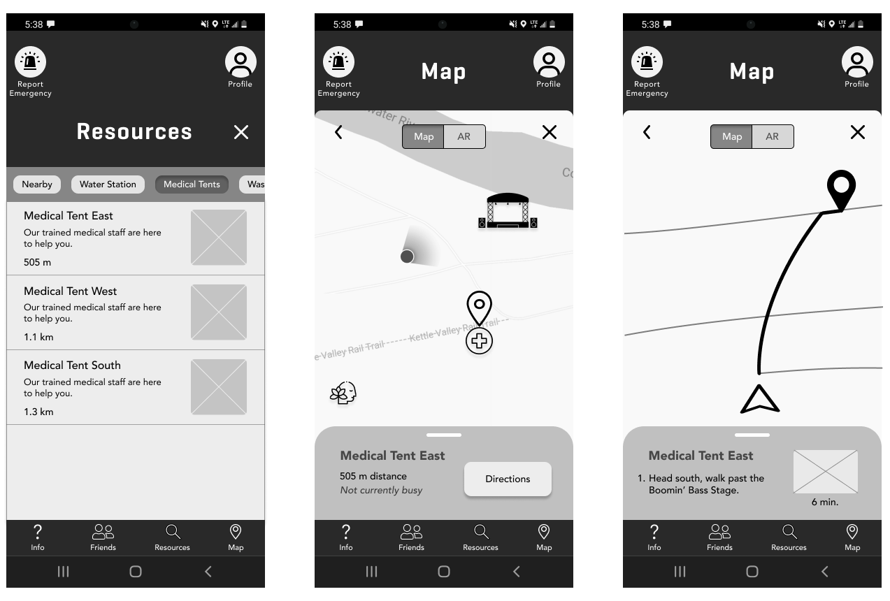
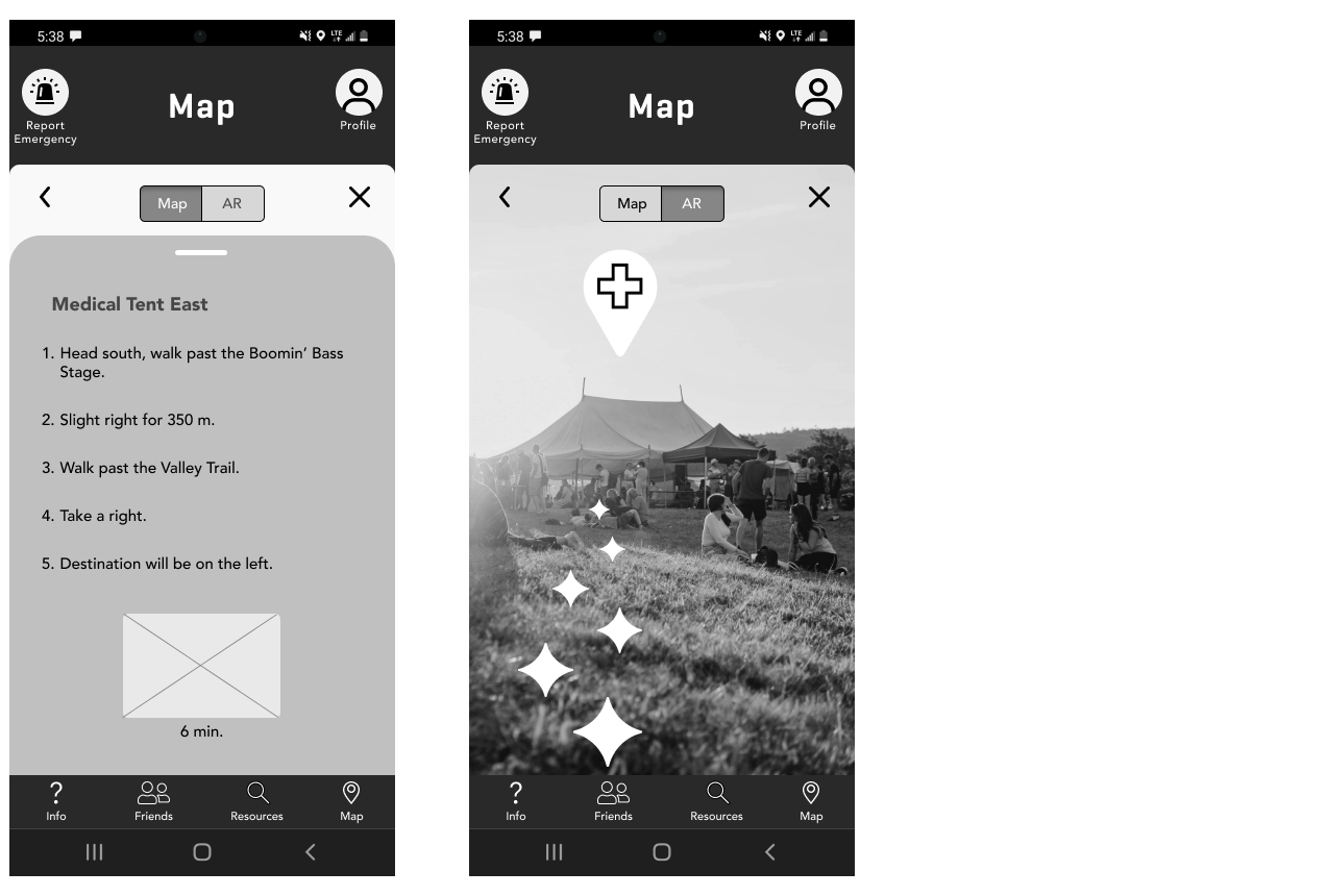
Task Flow
Epic:
Easier location of important places/people
Task:
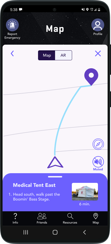
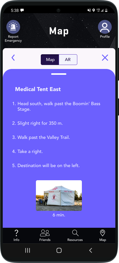
Locate medical tent using digital wayfinding and AR technology
Persona:
Festival Attendee who is not feeling well
User Story:
To be able to easily locate medical tents so that I am aware of where I can go to get help
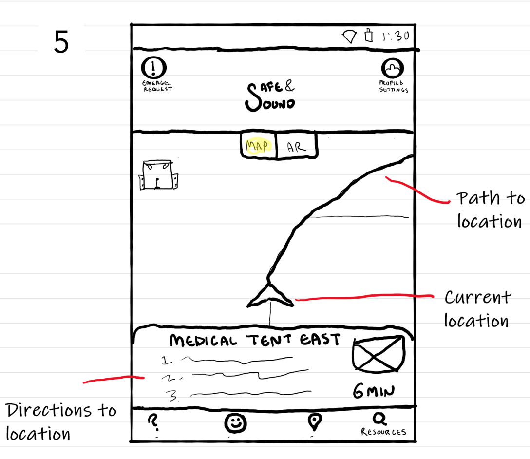
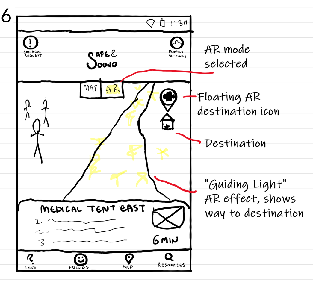
Sketches
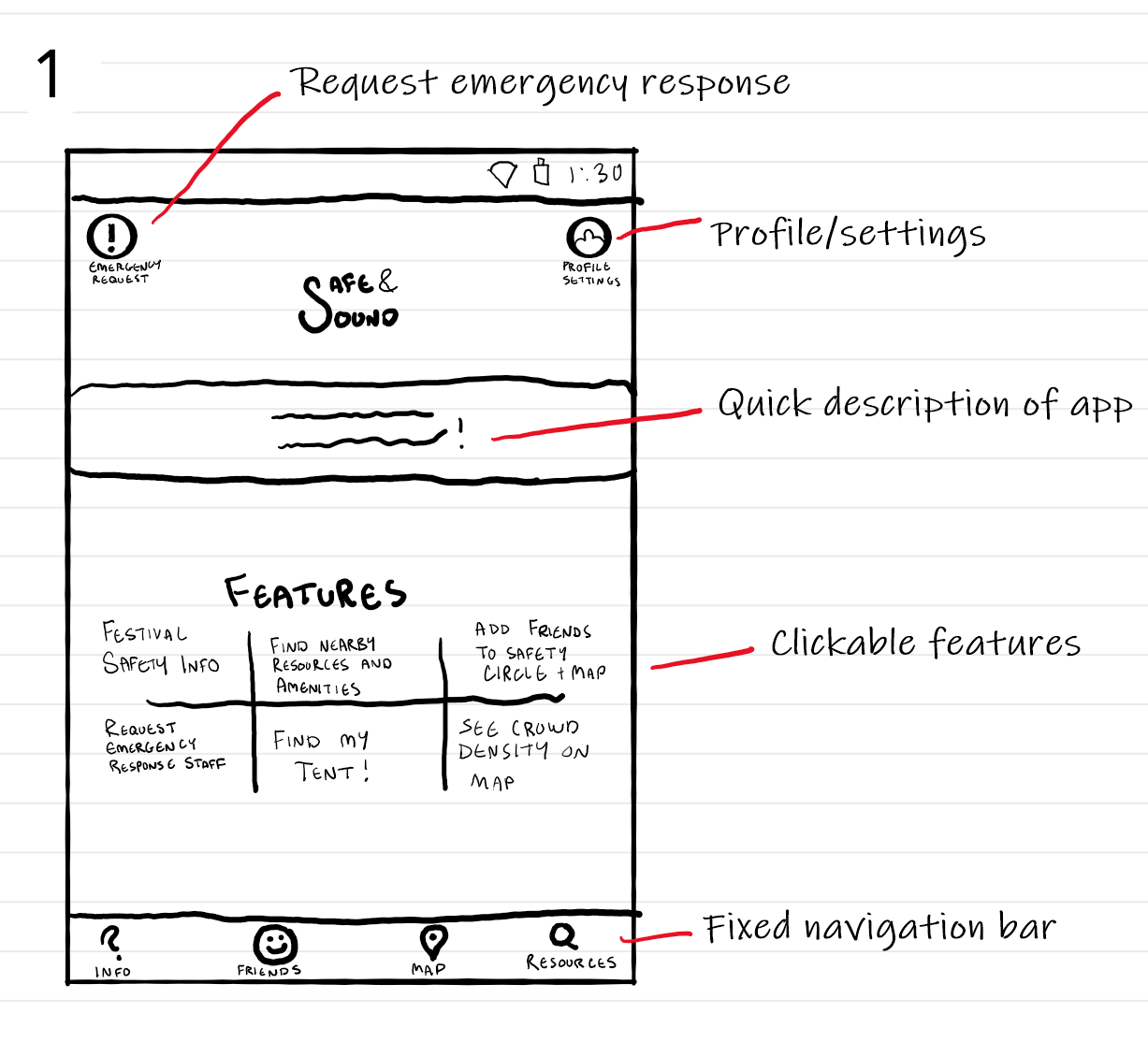
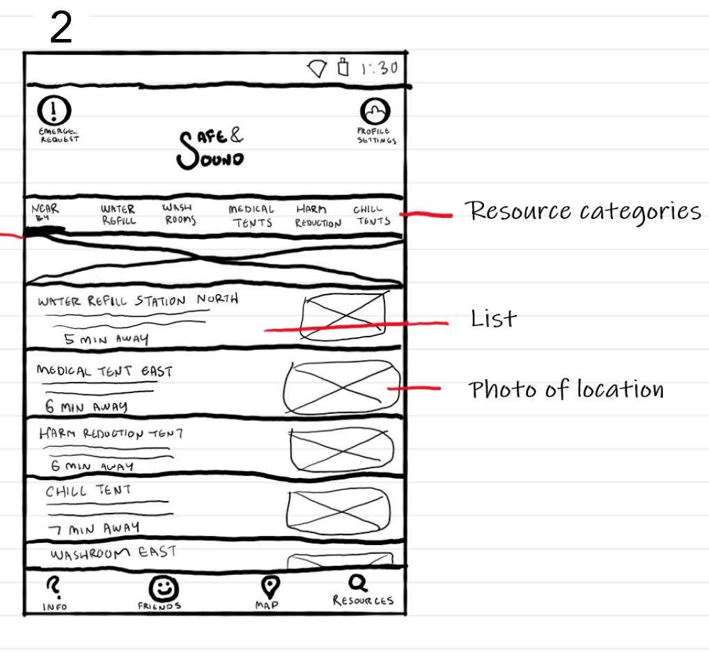
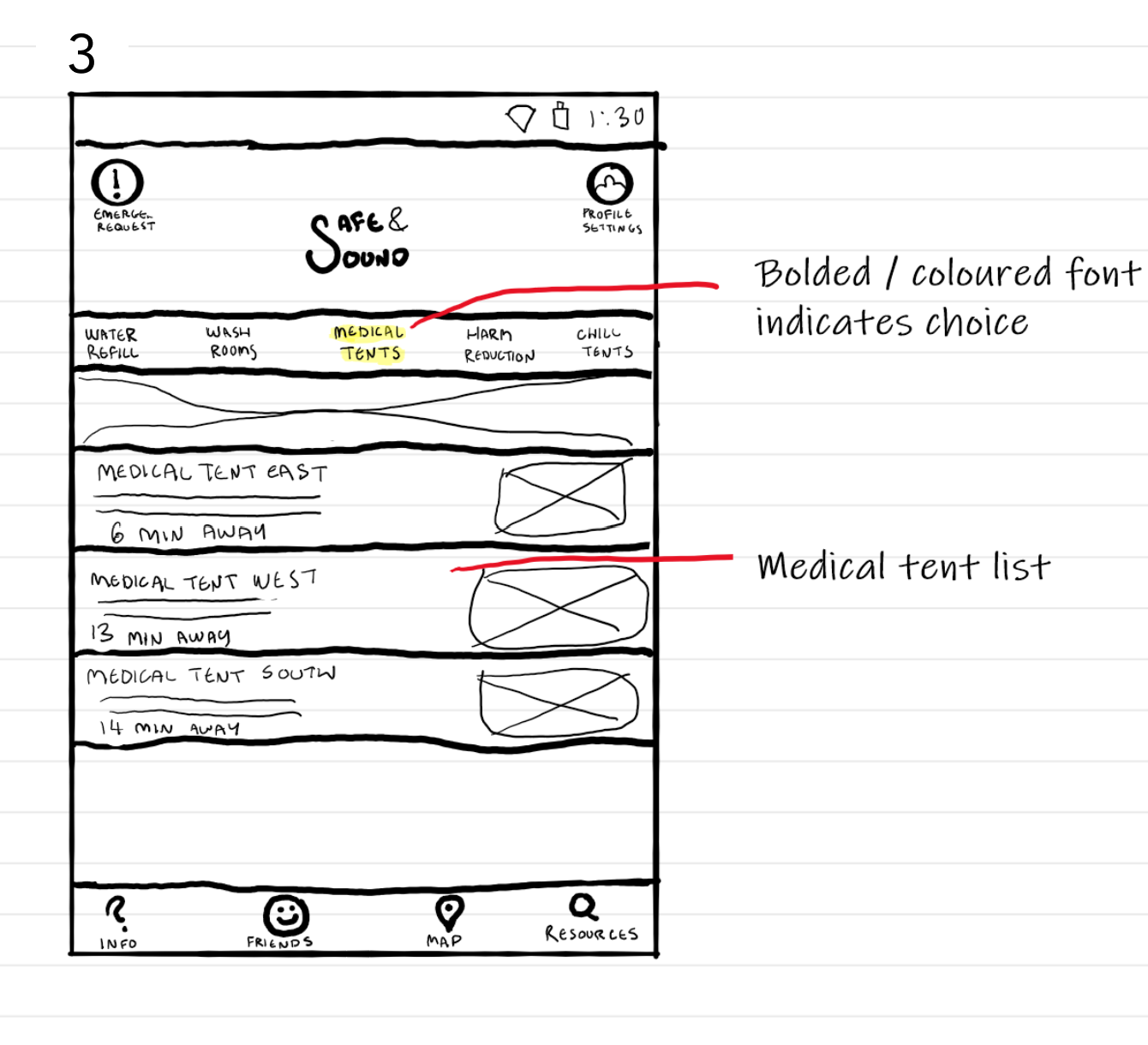
Once the task flow was complete, it was time to start sketching potential ways the process could look like on a mobile app. After sketching a number of concepts, I chose this concept to go on to refine.
Medium-Fidelity Wireframe
Carrying on to Figma, I made up the wireframes and turned them into an interactive prototype. I then conducted user testing with 5 people, and made a new iteration based on the feedback. One more time for good measure, I repeated these steps until I had my 3rd and final medium-fidelity iteration of the prototype!
Gallery comparison of each screen iteration:
Version 1
Version 2

Version 3
User Testing Sessions
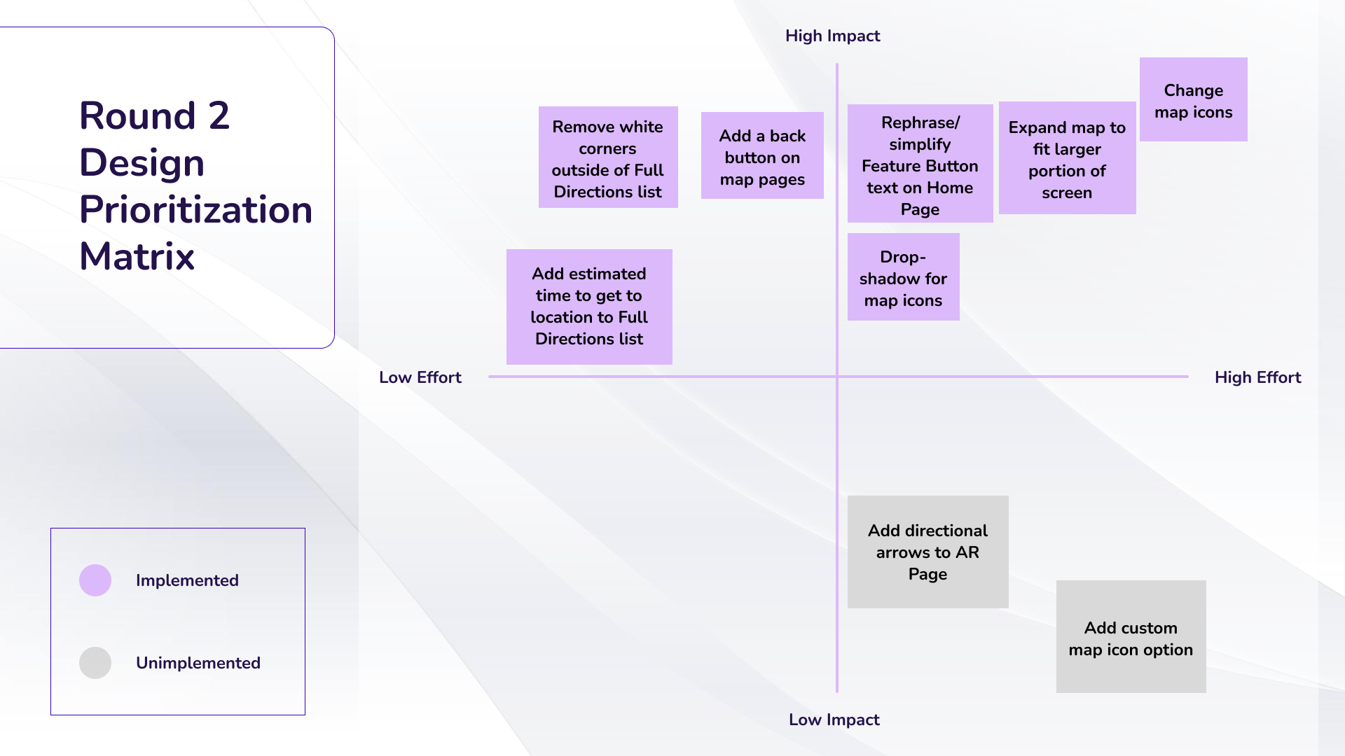
To explain why I made the changes I did, I'll show data from the two user testing sessions and subsequent design prioritization matrices.
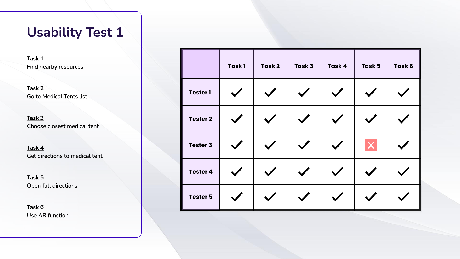
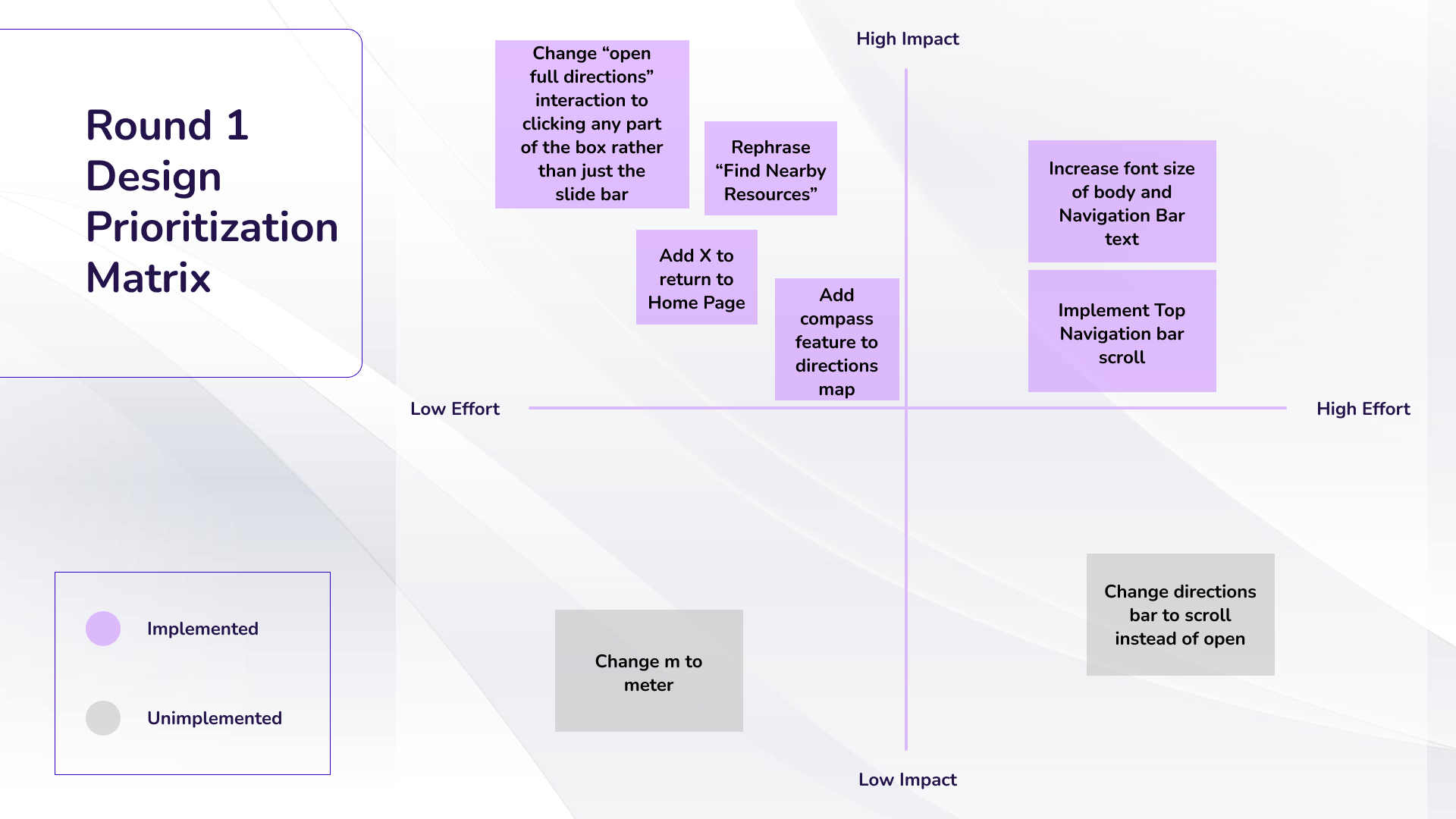
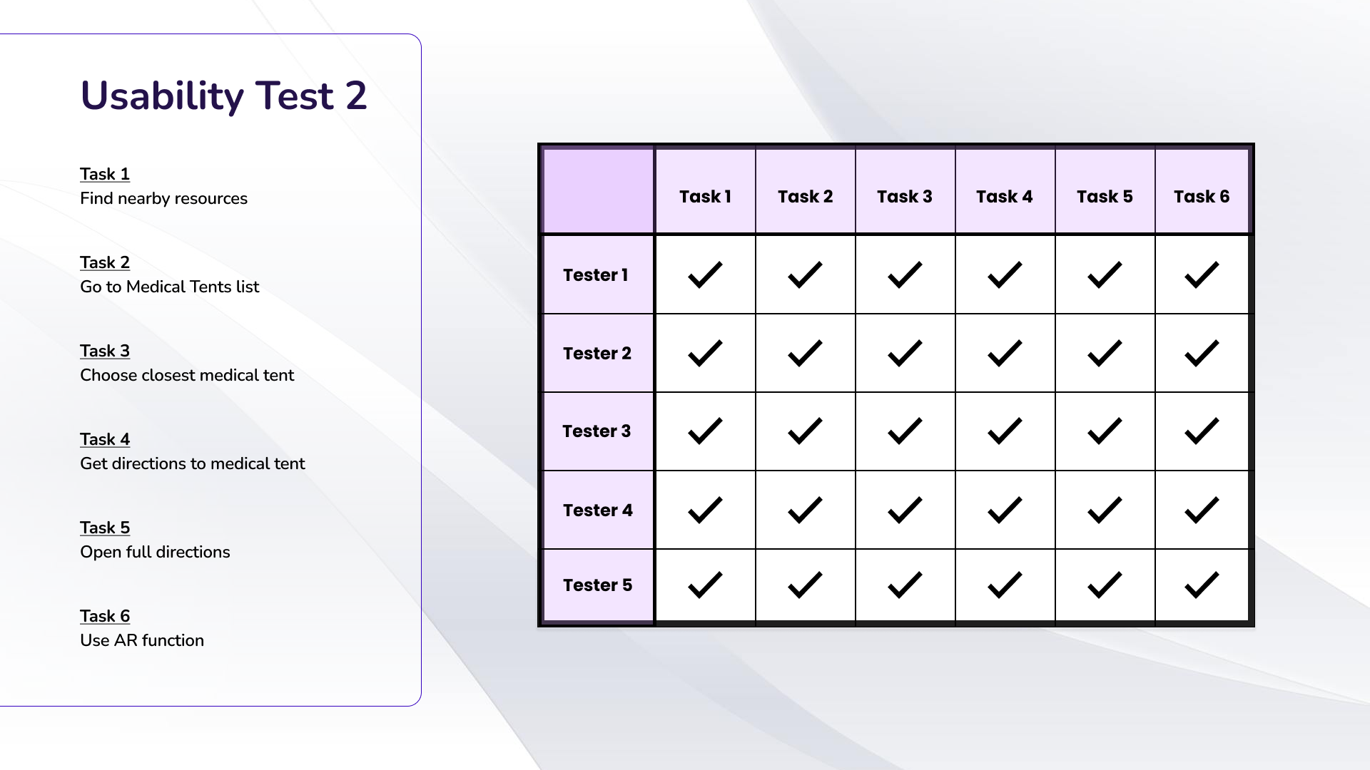
The most common concerns noted throughout the two usability tests were:
a) Opening full directions was difficult for users in Test 1. Based on my observations of the tester's behaviour, I realized I would need to make the whole box a tappable area to bring up full directions, rather than just the pull-up bar area. It was no longer a problem after that change was made.
b) Rephrasing some of the home page buttons was necessary. On the first user test session there was a slight hesitation from some testers when figuring out where they would tap to get help in the scenario that they weren't feeling well. Upon changing the phrasing from "Find nearby resources", to "Find nearby help and resources", the issue was resolved. There were also a few other rephrases made to keep things as succinct as possible.
c) Several users noted that they wished the map was larger in Test 2, so the map size was increased.
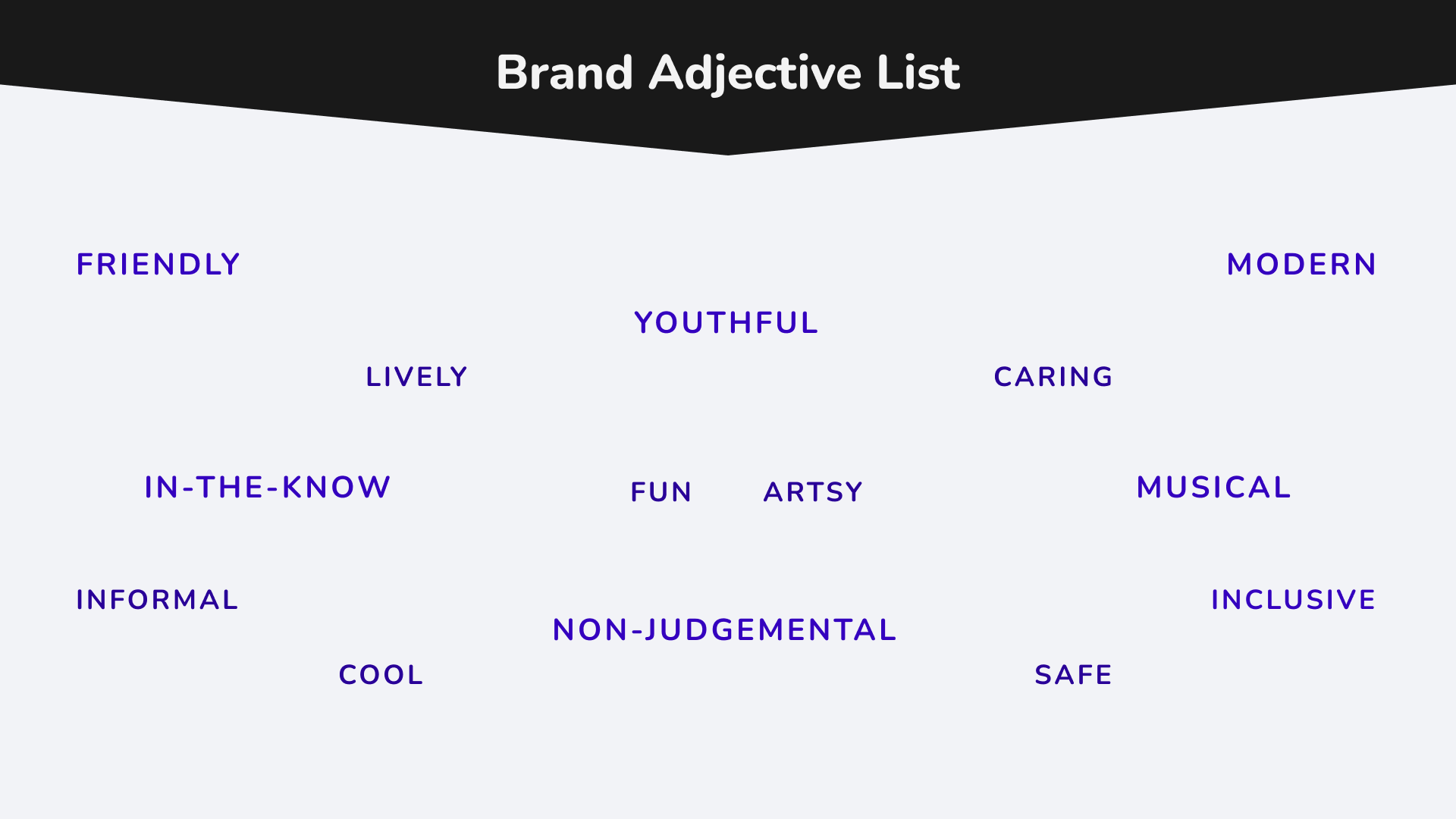
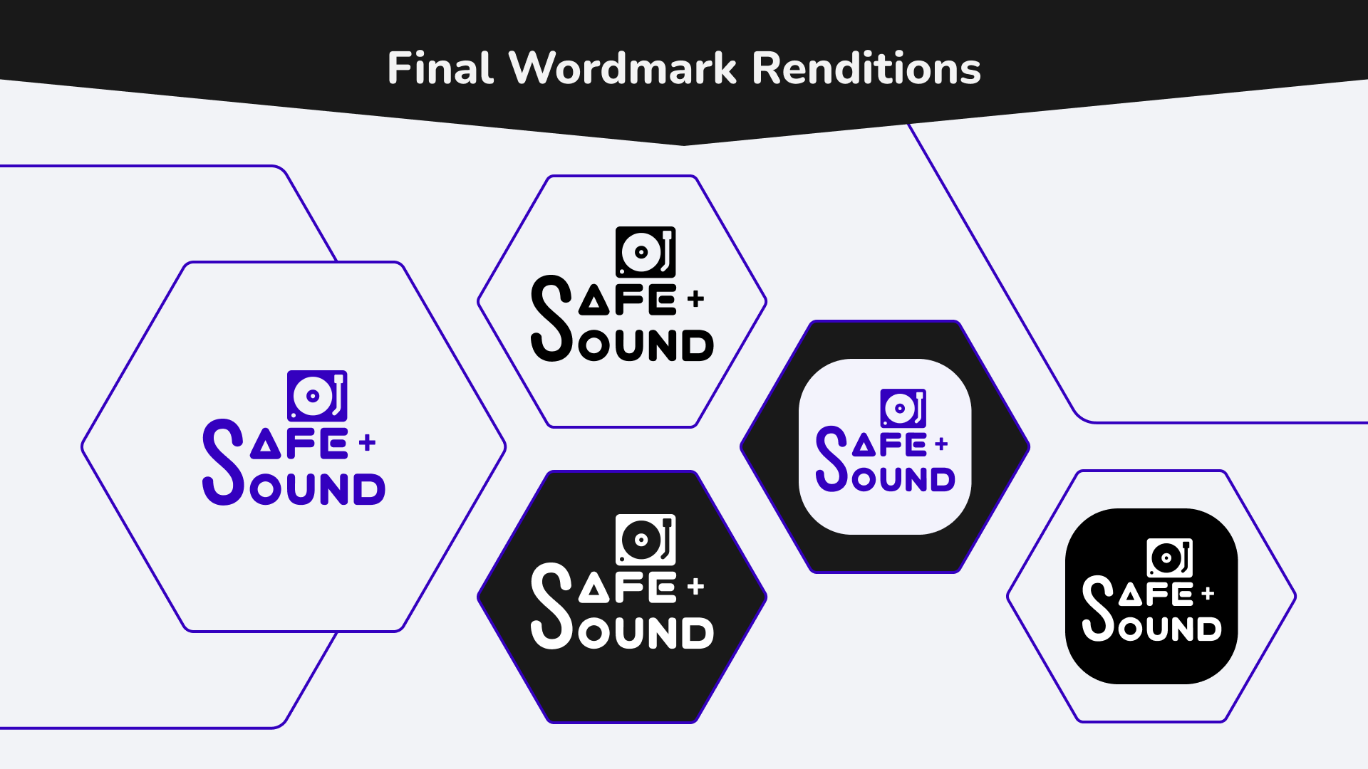
Brand Development
Keeping my target user in mind, I went through a series of brand development activities to capture what the brand's culture, personality and values were.
Shown here are:
1. Brand adjective list
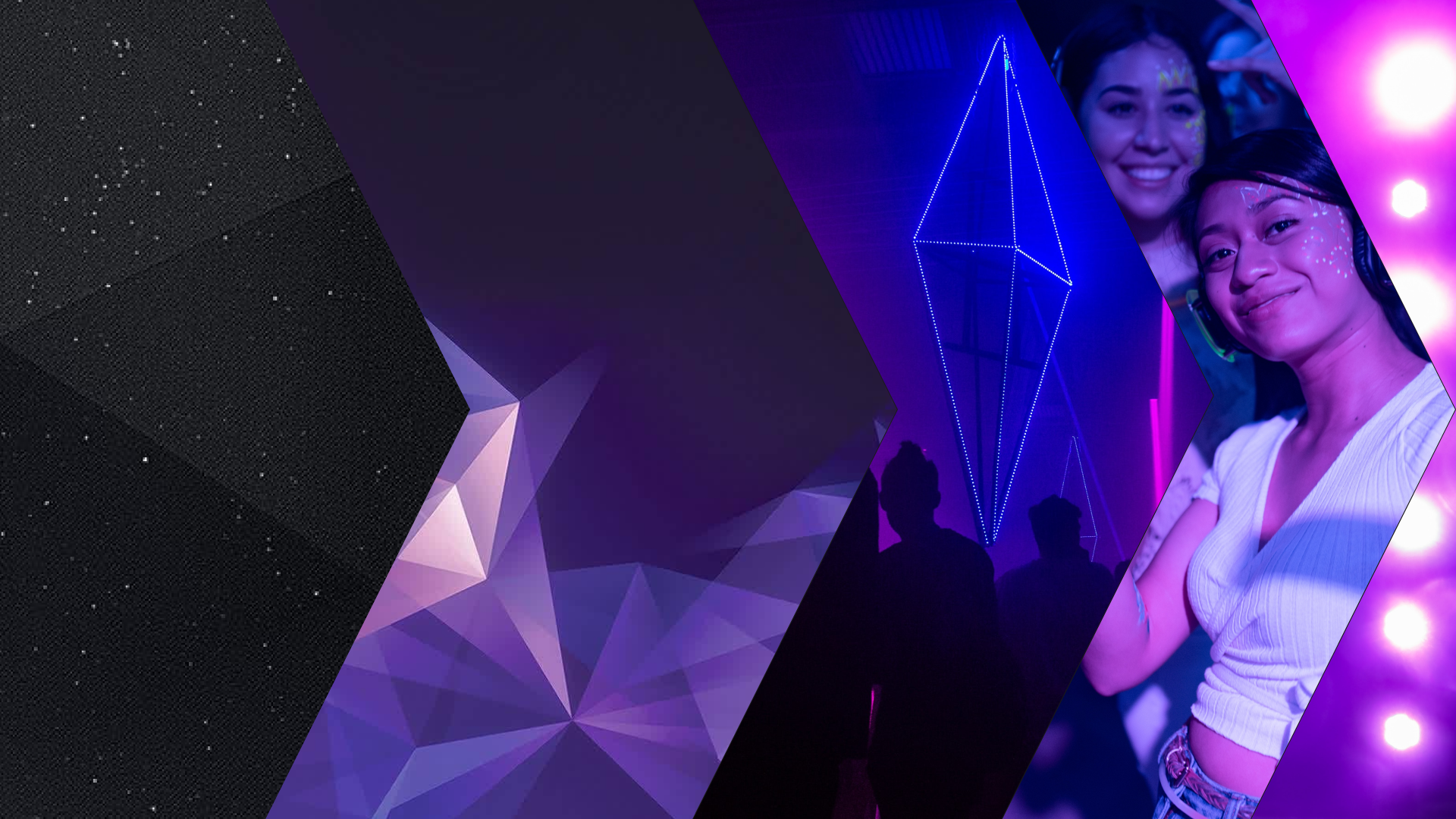
2. Moodboard. See full moodboard here.
3. Finalized wordmarks
4. Colour list

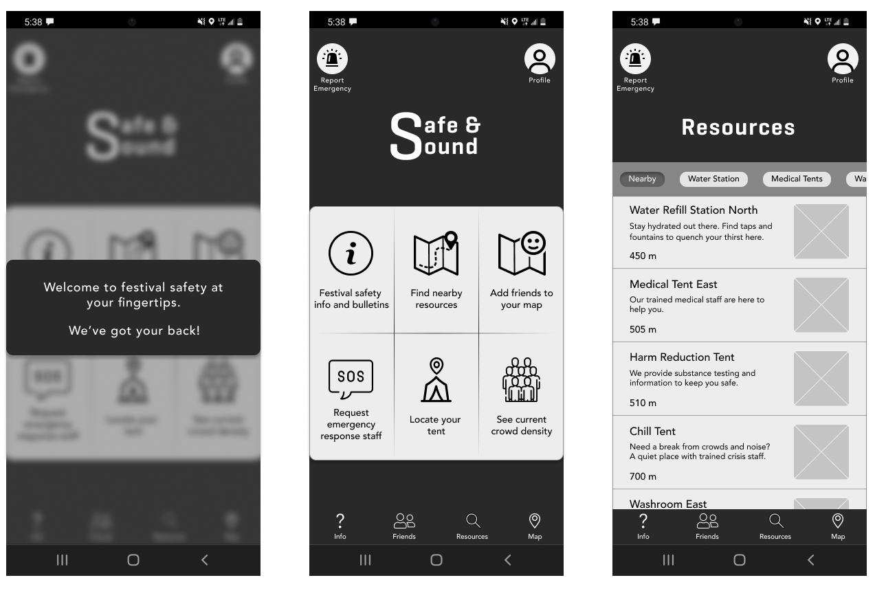
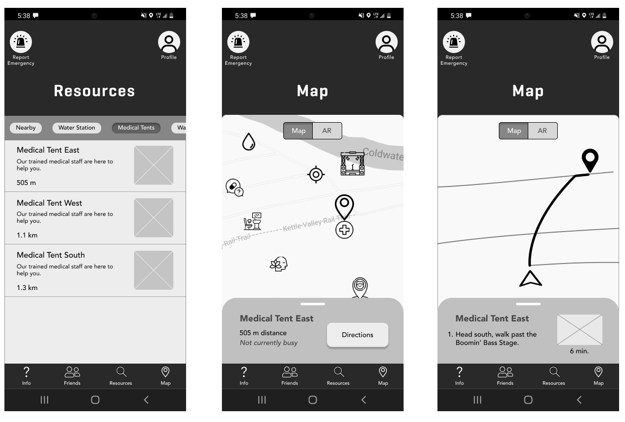
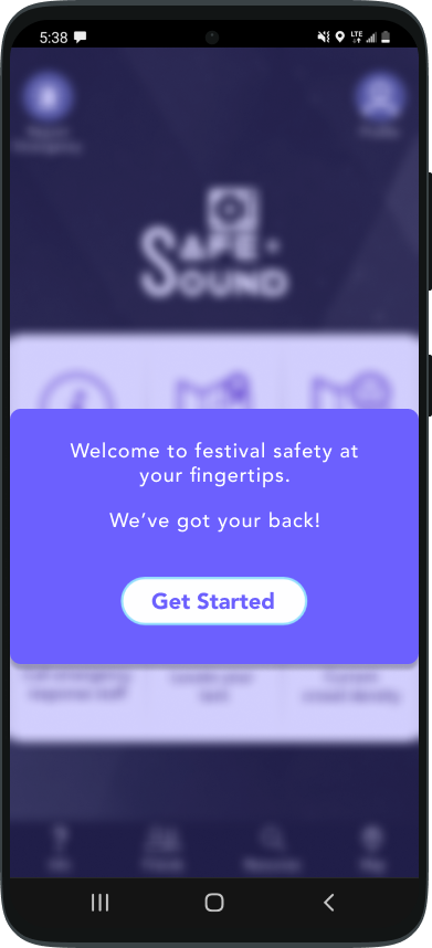
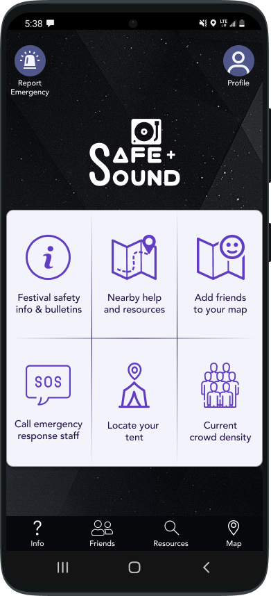
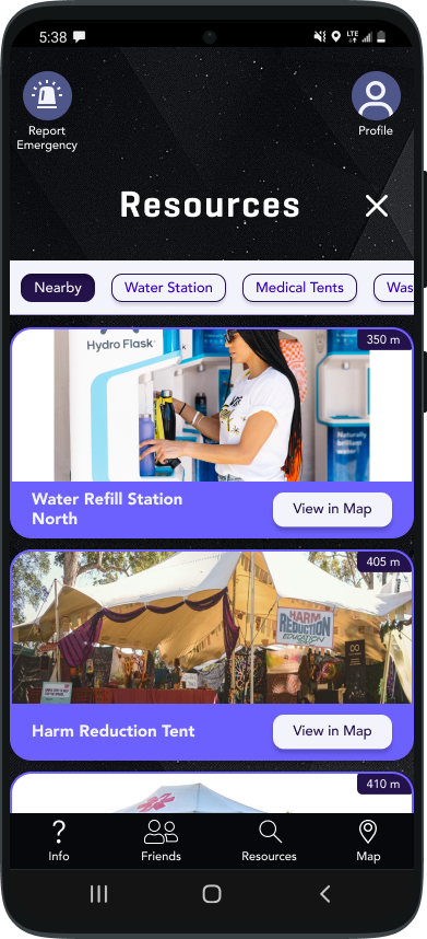
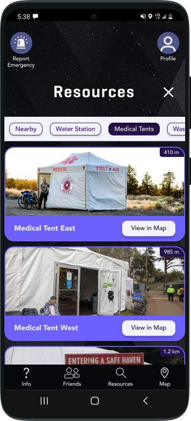
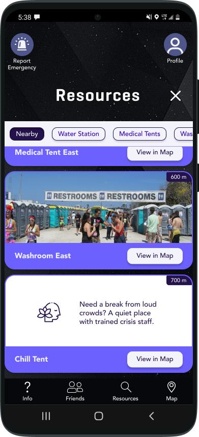
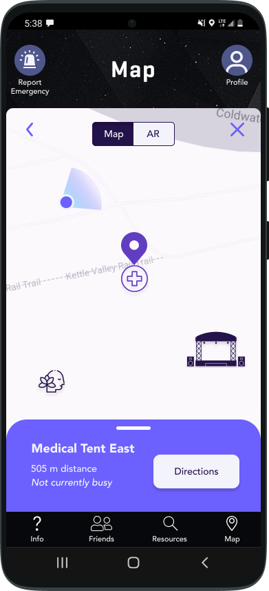
High-Fidelity Prototype
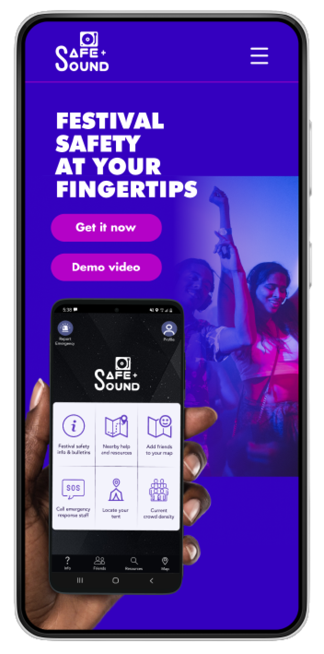
With the visual identity of the app in place, it was time to adopt the branding into the app itself.
Now, I’d like to present the high-fidelity prototype of the Safe & Sound app.
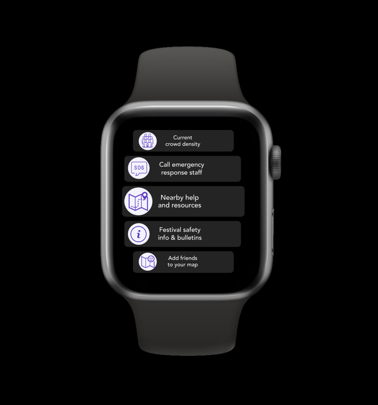
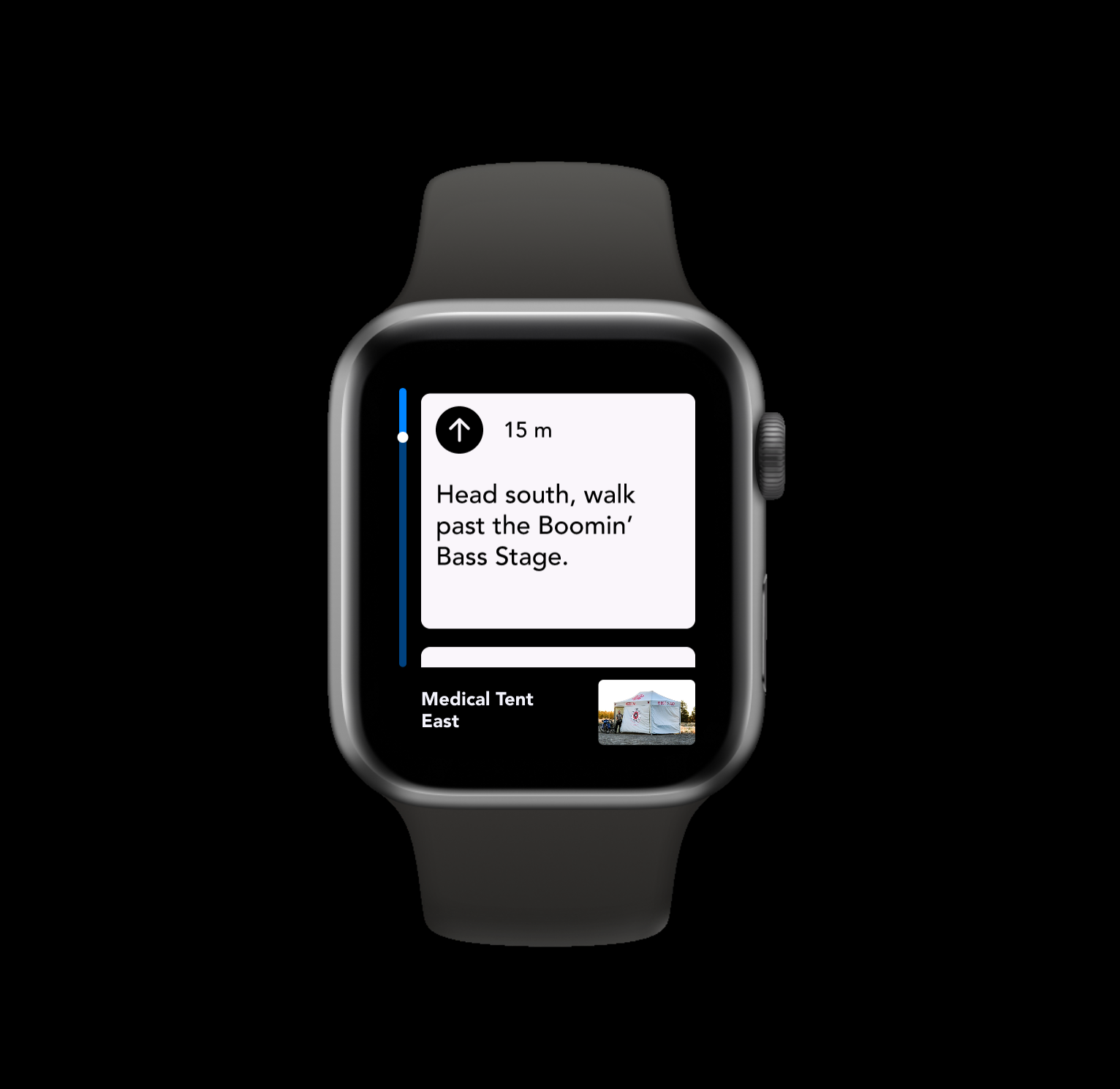
Apple Watch Redesign
To add another option, I created an alternate version of the prototype for users who would have their apple watches on them at the festival!
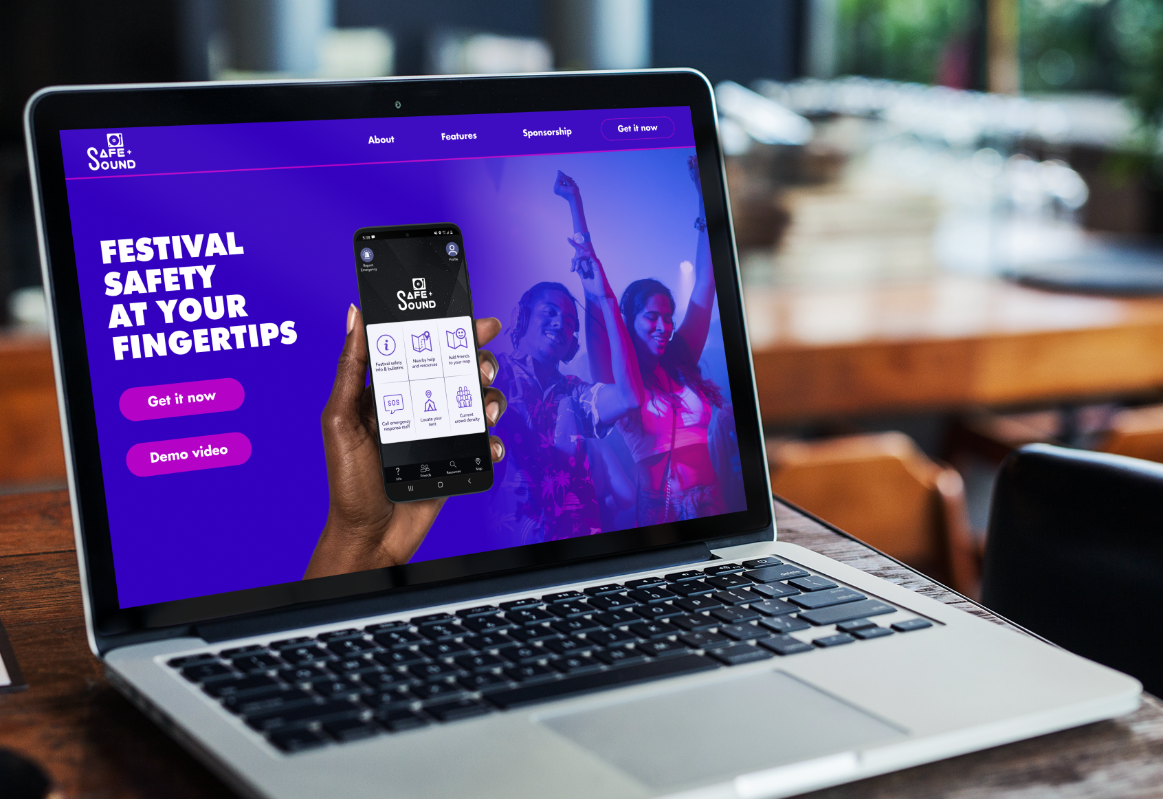
Responsive Marketing Website
In order to advertise Safe&Sound, I created a responsive marketing website so that potential users could learn about the app and explore it's features.
Reflection
Finished is better than perfect
I tend to ponder things for quite some time and get a bit obsessive over making things perfect. Going through this process in such a short time while juggling other assignments was a great learning experience for me to let go of certain things and just do the best I could in the timeframe given.
I think the rate in which I can work in this context has grown significantly. It reminds me of many other skills I've learnt over the course of my life, and how momentum and precision get built up with practice and time.
Research is key
Had I not gone through the research process, there are so many nuances about the festival culture and current design systems that I'd have completely missed, which would have sent me in the wrong design direction. Thankfully, I got some great insight from my research, which helped me stay on track with what the real issues were, what users would want, and the given constraints.
UI Libraries
I now understand how important it is to create a design system early on, as it is a huge time saver and keeps things consistent. I've learnt some great Figma tricks that have helped me get things done efficiently!
Next Steps
I'm not done with this project yet. There are still a few things I'd like to work on after the course is finished, such as:
• Refine the high-fidelity prototype
There are definitely still a few tweaks I'd like to make to the prototype - I'd like to work on those and run a few more user tests to get the high-fidelity prototype to where I ideally want it to be
• Look into the implementation process of mass tethering for apps
One of the constraints for certain festivals is that wi-fi is spotty in certain areas. One work-around for this would be to create a mass-tethering network through the app, wherein all users with the app are automatically joined to wi-fi tethering, so if one person has wi-fi it will send the signal to another user and they will send the signal to someone else. That way everyone will be able to access that wi-fi, as it will bounce from device to device!
• Building out and highlighting the COVID precautionary features
One of my features was heatmapping the crowd density in the festival area, so if people felt more comfortable in less people-saturated areas, they would know where to go. I think this kind of feature could be very relevant in the future of events, not only for this app but for many other kinds of event apps, so I'd like to spend more time on it.
Selected Works

ChatFusionProject type

Webhook Reference Page RedesignProject type

BreakTimeHackathon Industry Project

Safe&SoundCapstone Project
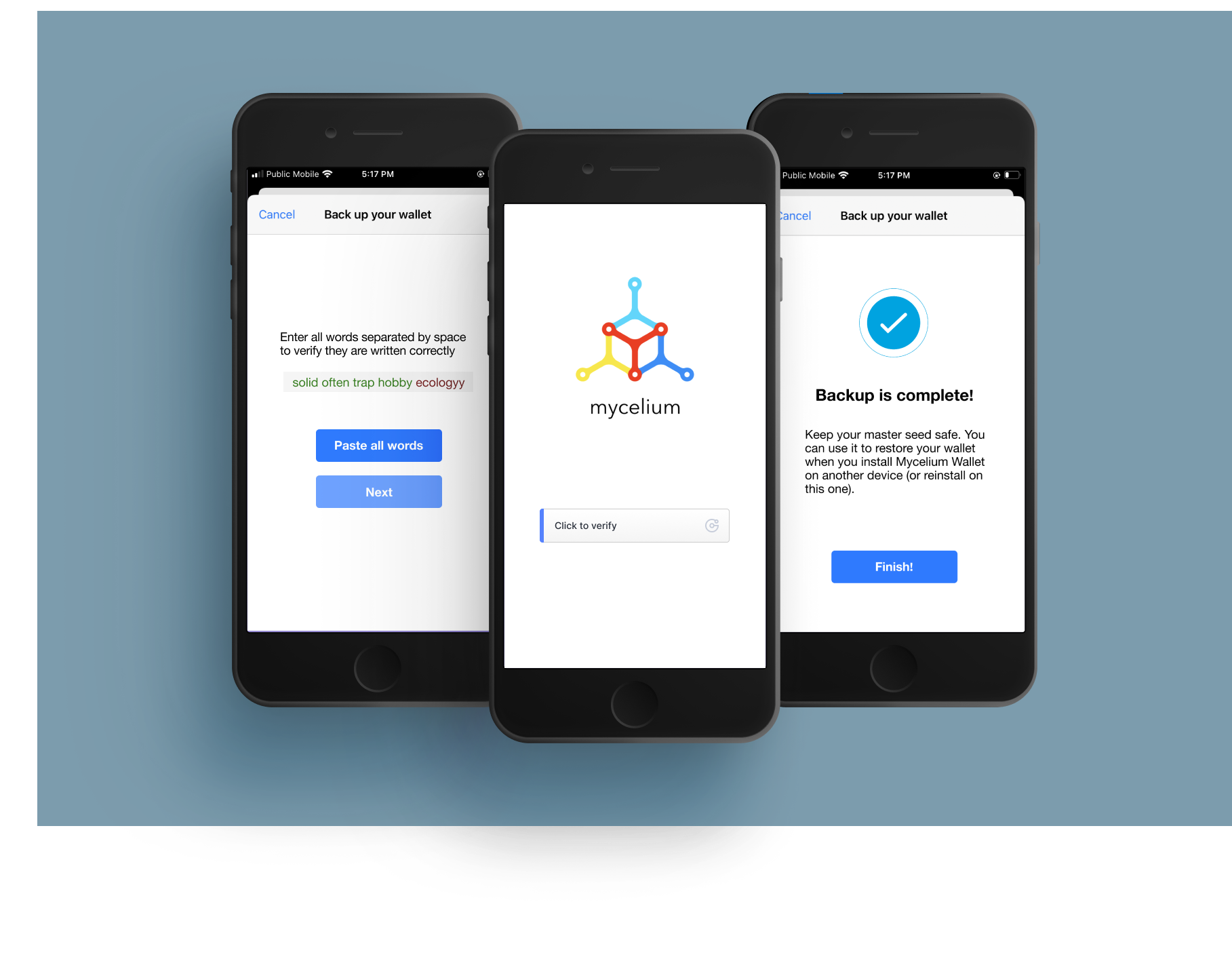
Mycelium App RedesignHeuristic Redesign